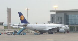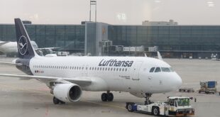
Lufthansa has overhauled its livery, changing the background of its iconic century-old logo from yellow to blue. The crane, remains the airline’s iconic symbol, but it has been slimmed down in this incarnation and is surrounded by a thinner ring giving it more space.
The German airline officially unveiled its new brand image on Wednesday (7 February) at company events in Frankfurt and Munich.
The redesign marks 100 years since the airline introduced its crane logo.
“Lufthansa has changed and is more modern and successful than ever,” says group chief executive Carsten Spohr. “From now on, this will also be visible to the public through a new design.”
The livery is intended to better reflect Lufthansa mainline’s focus on premium markets, Spohr adds.
While the airline seeks to modernise its image with the rebranding, many aviation experts have criticised Lufthansa for the move. Critics say the old logo with the warm yellow colour is much better than the new one with blue.
“Lufthansa now joins LATAM, Iberia, Avianca (and more) in this ubiquitous Eurowhite, bland, pointless design pattern,” tweeted Enrique Perrella, publisher and editor in chief of Airways magazine.

Design journalist Daniel Golling said the move meant Lufthansa was about to strip its fleet of “one of its most distinguishing features,” adding that Lufthansa yellow “stood out among all the white, blue and red in the airline industry,” and appeared at every point a customer came into contact with the brand, from the check-in counters to the luggage tags.
Aviation writer Enrique Perrella described it as “bland and pointless”, while industrial designer Clemens Weisshaar said it was a “design belly flop.”
Lufthansa however said the response to the new branding has been predominantly positive, but some people missed the yellow tone. It “will be found in the future, on every boarding pass and at every Lufthansa counter at the airport,” the airline reassured.
Lufthansa said the changes of the livery will be rolled out across its fleet of 330 aircraft over the next eight years.
Sola Jolaoso